If you’re already an e-commerce merchant running on BigCommerce and you’re contemplating changes to your user experience, you are likely considering:
- a complete redesign
- tactical enhancements or even
- replatforming.
Perhaps your business is in the position of adapting to post-pandemic market changes, omnichannel forces like the opening of a new physical location, or you are a startup getting ready to spend media dollars to drive targeted traffic to your site. In each of these cases a “Lift & Shift” approach to enhancing your BigCommerce website may be the approach to achieving your objectives. While not a complete wholesale redesign, a “Lift & Shift” approach is a flexible framework that seeks to improve visual experience, and the most important components of user experience, all the while being the least disruptive approach to your operation and cash flow.
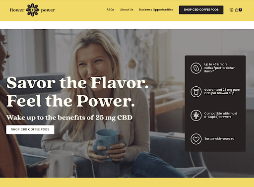
We recently completed a “Lift & Shift’ for Ambrosia Innovations’ Flower Power CBD-infused Coffee brand. The steps included an accelerated discovery, define and design process with a unique adjustment to core brand components including logo and typefaces, a theme-focused redesign of the UX, and visual design enhancements. The visual results are remarkable and are allowing the brand to go to market as a part of a wholesale shift in corporate strategy and positioning: leaders in the technology and manufacturing behind infusion of supplements into popular consumer beverages.
Before:
After:
Why it Works
Why does this approach work and what are the key aspects that make it faster and easier than a wholesale redesign? It’s all about the process and the project plan.
- BigCommerce themes are extremely flexible: this makes it easy to permit scope creep into the visual design aspects of the project.
- Limit the scope: Merchants are of course always looking for new features that can help the business, but in this case limiting scope to functional changes that have the most ROI is a key part of the project charter.
- Utilize an experienced visual design team: There are many great web designers, but the more experienced ones also have an understanding of how they can effectively introduce practical visual changes and user experience enhancements within a minimal amount of time. We do this by first engaging in a rapid audit of the current user experience including examining visual aspects of low hanging fruit functional problems. The top-notch designers (like ours) will be able to do this while also using a design framework that make the technical development process as streamlined as possible.
For the Flower Power Coffee project, our design team used a Figma-based review of brand and UX enhancement options, and the client team was highly responsive in providing feedback and suggestions. Hence, revision rounds were minimal. Once visual designs were complete, the “shift” was completed using a pre-built Stencil-based theme with a minimum amount of customization needed to complete the new site.
Site production, including front end development took about a month but there were few complex integrations and, since a standard BigCommerce theme was used, no 3rd party components or integrations needed to be re-worked.
The Key Success Factors for a Lift & Shift
1. Minimize Scope Creep by Agreeing to Launch Requirements
The only major challenge with a lift & shift approach is that it can invite scope creep. So it’s important to flush out requirements ahead of development and production so that…
… 2. The “New” Site Stays within a Stencil-based BigCommerce Theme
Don’t waiver from this important project parameter. It’s the primary reason you can move quickly once your visual design changes are “signed off.”
3. Front End Developer Design Oversight
Also, remember to have a developer review designs and comment on any challenges or customization requirements.
4. Work with a Designer that Can Design Flexibly
This project got a brand makeover with a visual redesign because our design team was flexible and fast-moving and because the client was responsive and creatively willing to not just explore but accept proposed changes quickly.
Original Logo:
New Logo:
5. Be Willing to Accept Some Custom Code
Despite the use of a well-used theme there is a balance between the custom design that resulted and the theme’s capabilities. The merchant needs to be respectful of the need for theme customization but in this case it’s mostly outside of the core shopping experience and it’s all editable from admin with a little bit of HTML / CSS awareness.
The Bottom Line
A ‘lift & shift’ approach on BigCommerce can have very positive results without going through a comprehensive redesign or a replatform. There are trade offs but they can be outweighed by speed and operational efficiency. The process of going through a BigCommerce “Lift & Shift” can be much less disruptive than other project approaches. And now with Multi-store and B2B the framework could be extended to provide even more efficiency on those types of efforts.


